Mr
Simms
Sweet Traditions
with a Modern Twist
Mr. Simms, a traditional sweet shop brand from the United Kingdom, offers a wide range of both traditional and contemporary sweets. The brand is more than just a sweet shop; it’s about rekindling cherished memories and creating new ones. It was crucial to redefine and capture these timeless sweet shop traditions in the new brand expression.
Client/ Mr Simms (UK)
Creative Direction/ Paul Mynard
Strategy/ Paul Mynard, Ju Wen Cheng, Lee Skinner
Copywriting/ Elise Cotton
Lead Designers/ Ju Wen Cheng, Lee Skinner
Interior Ddesigners/ Emily Budden, Daniela Hurmuzache
Illustration/ Ju Wen Cheng
Case Study Motion/ Ju Wen Cheng
Photography/ Paul Mynard, Ju Wen Cheng, Mr Simms team
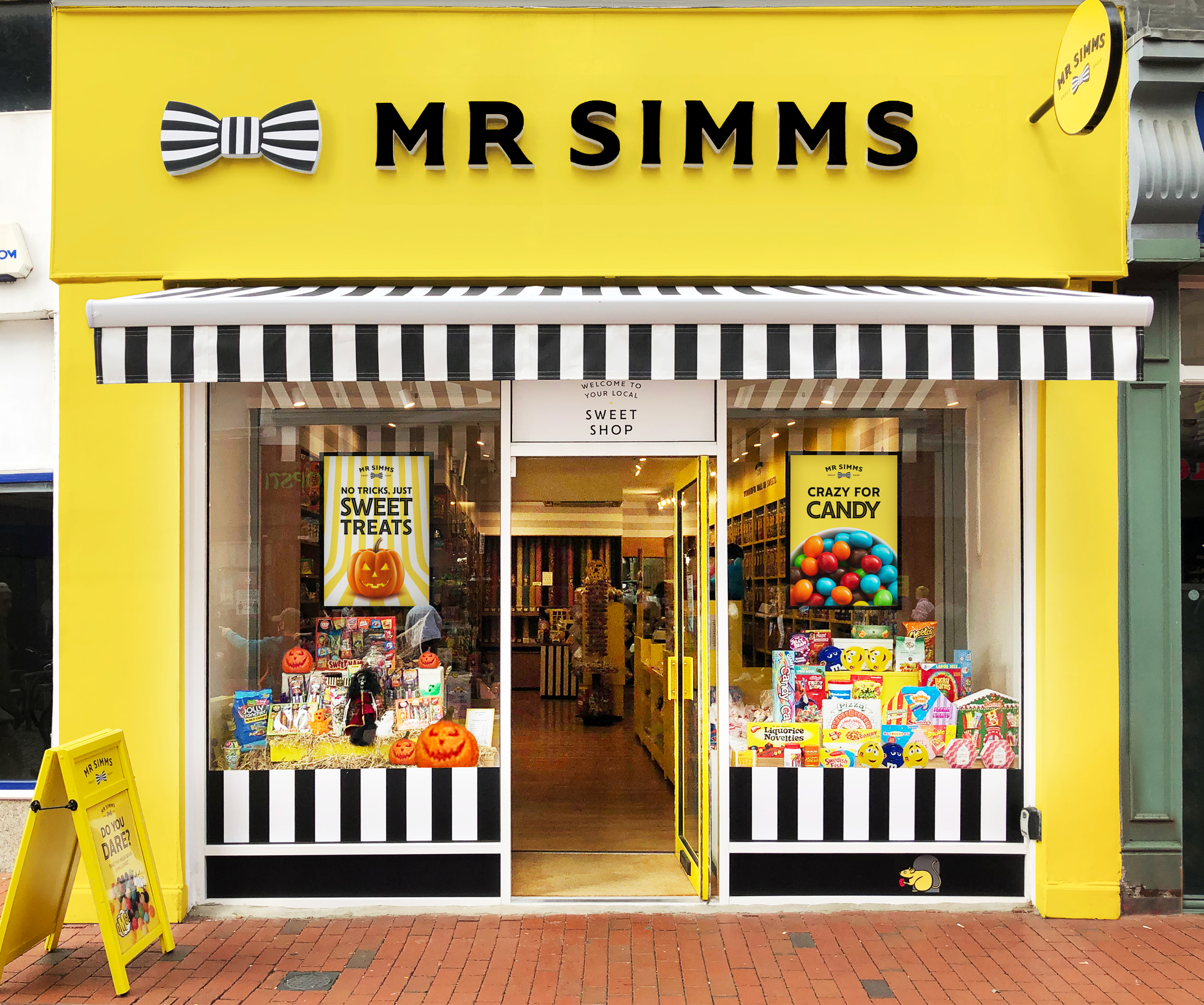
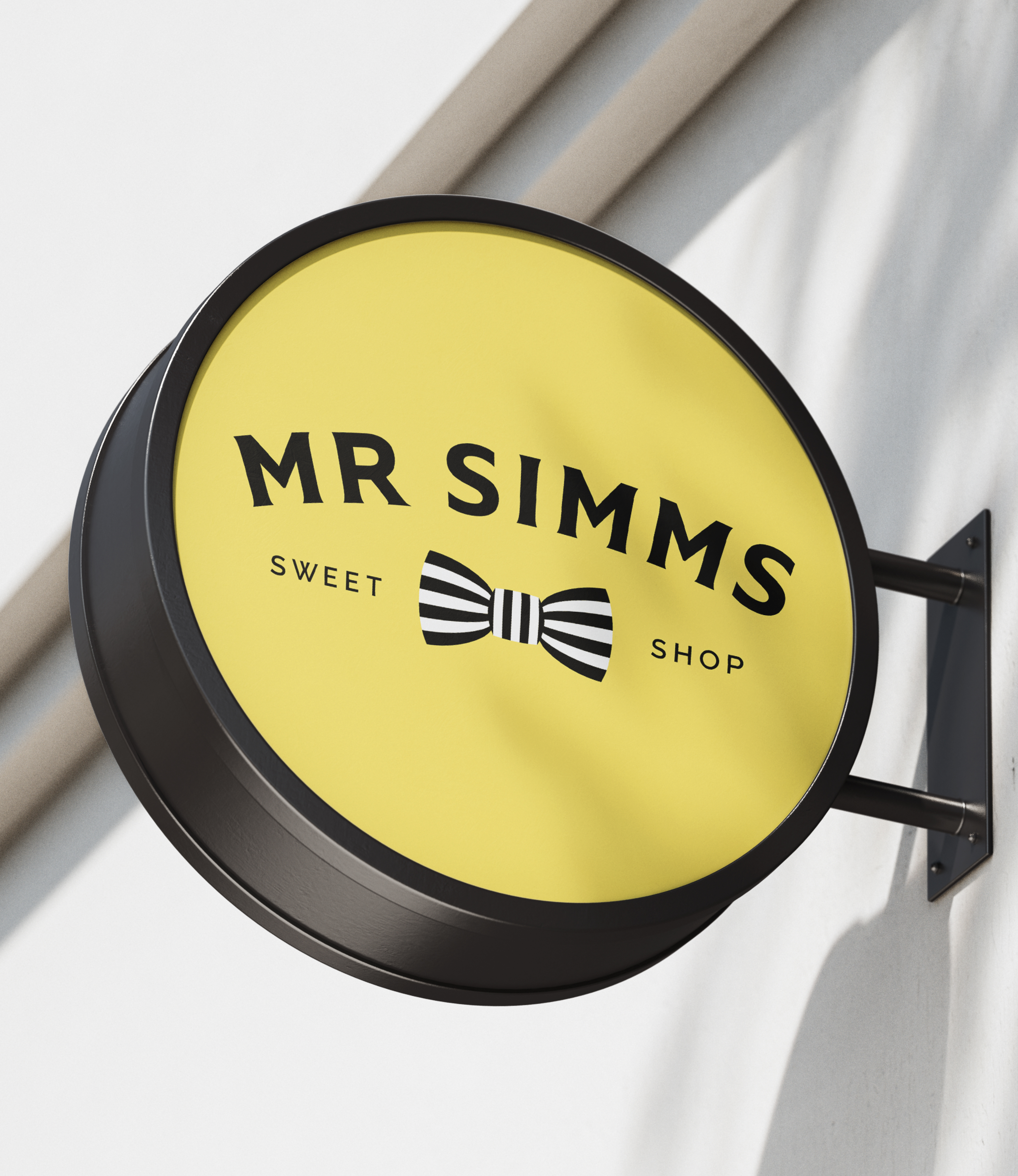
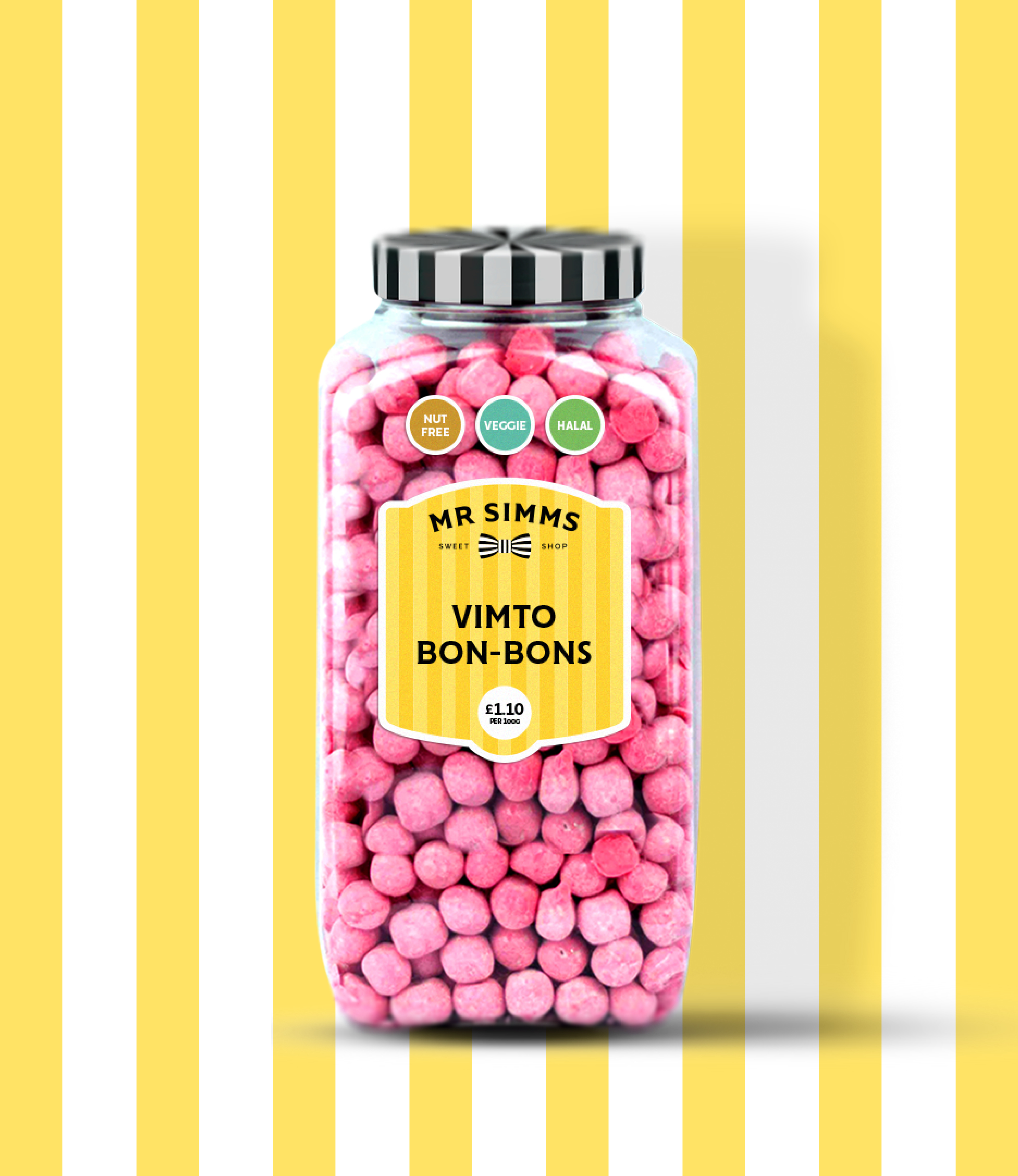
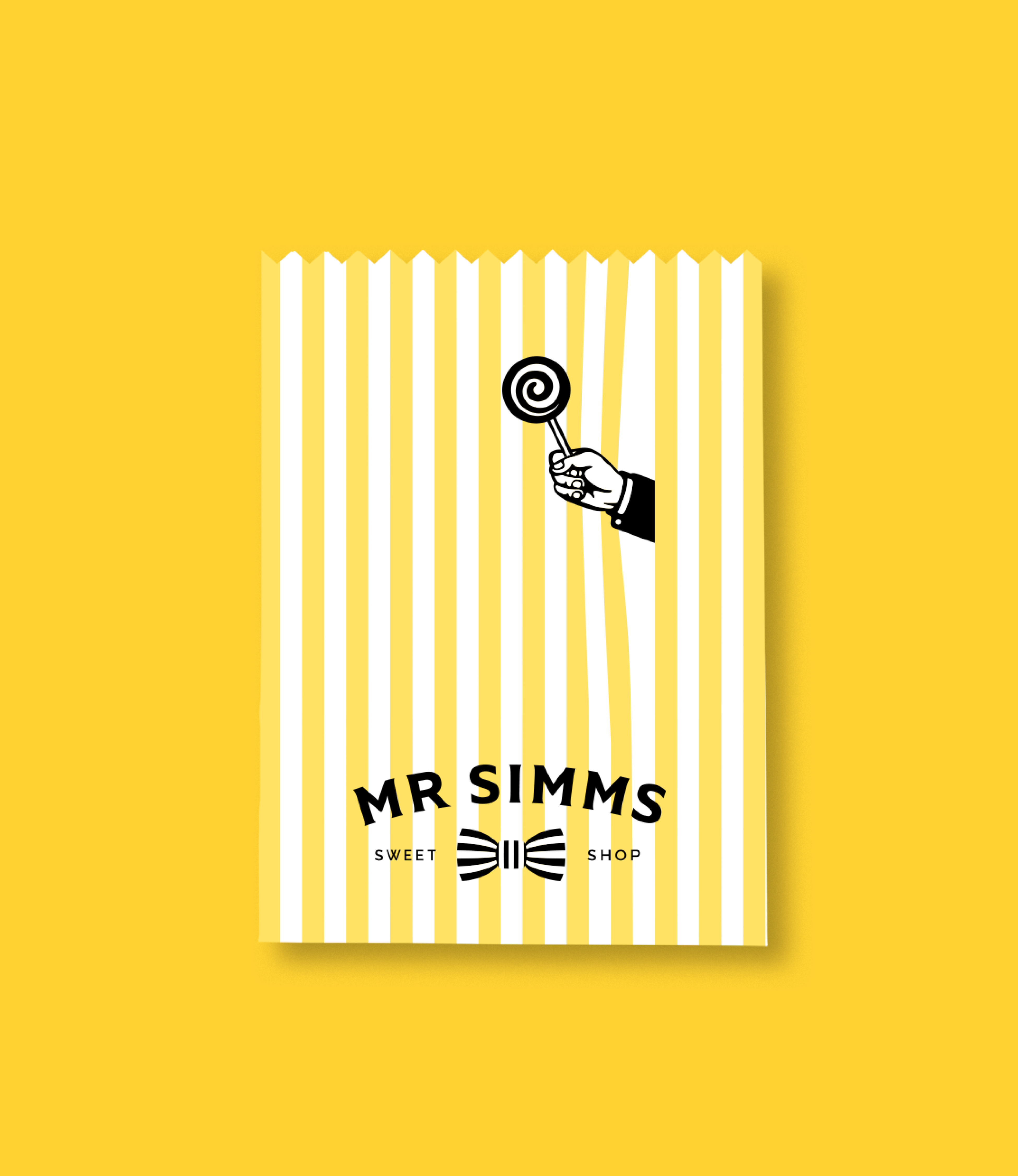
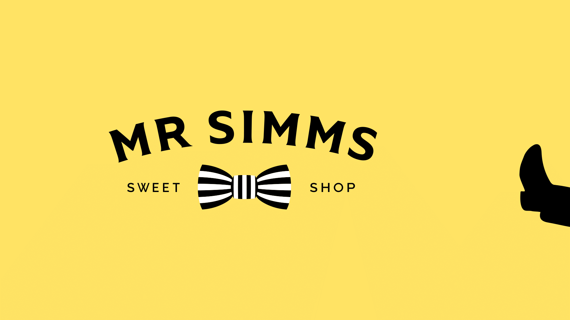
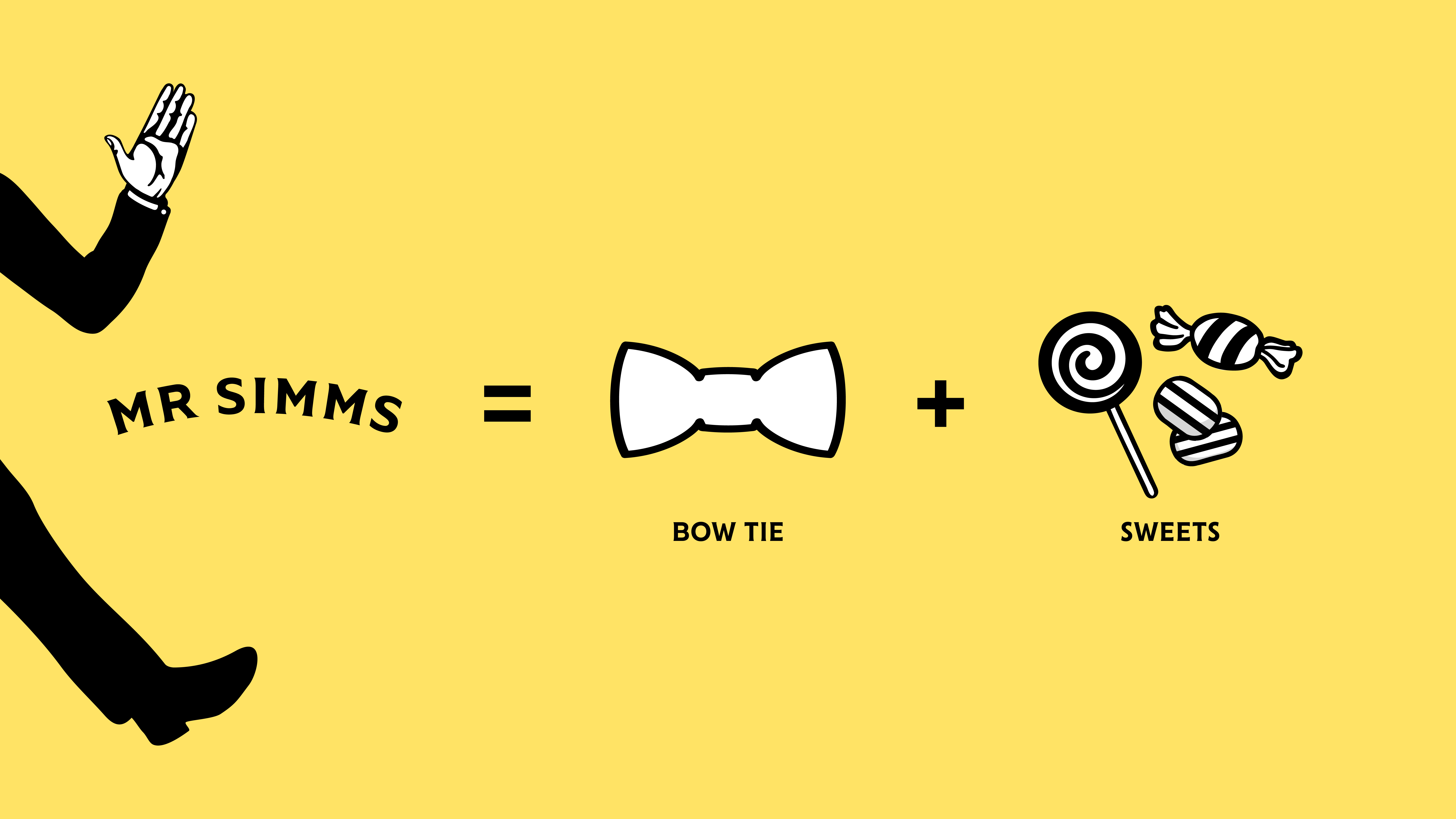
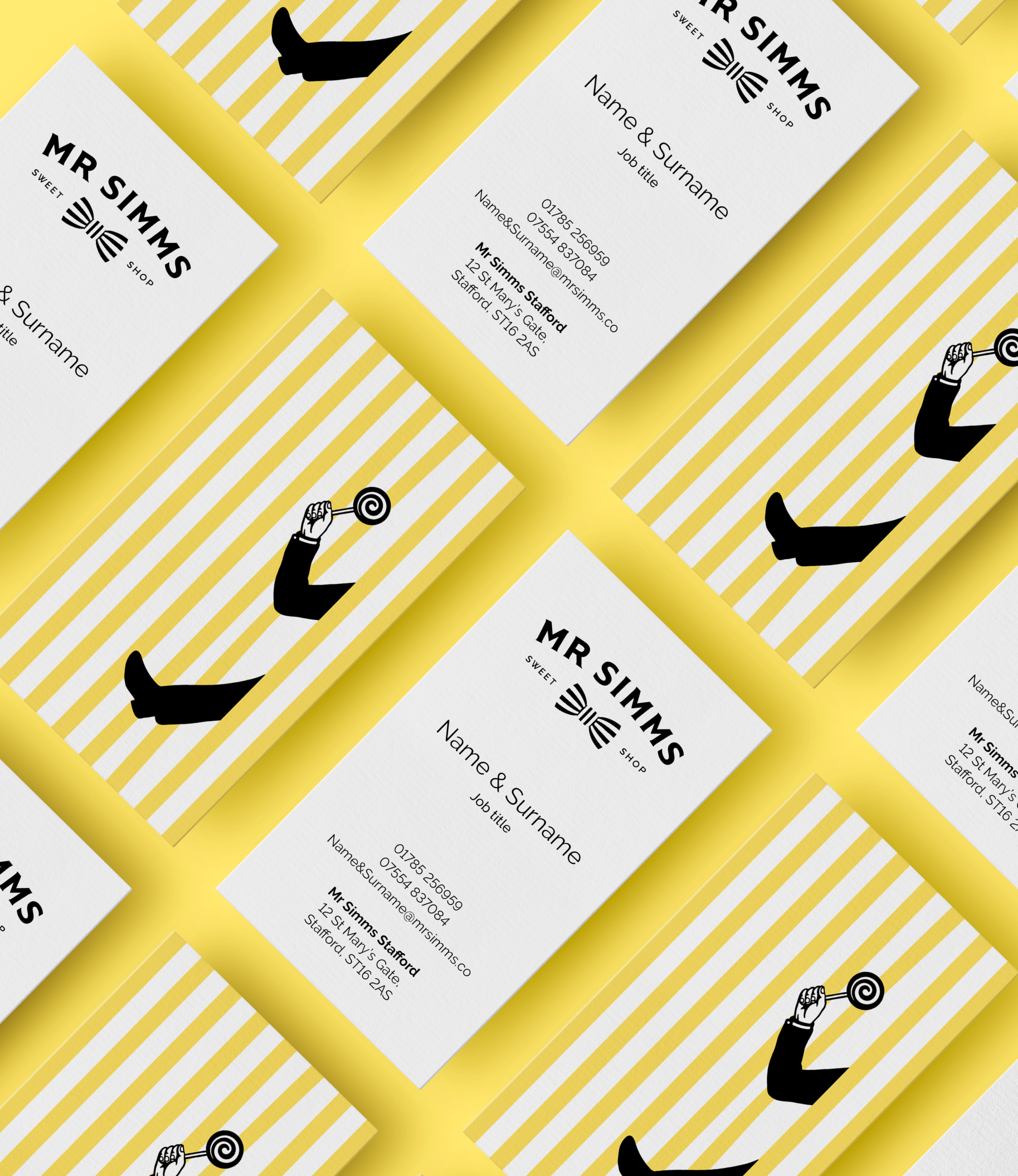
I worked with our team and designed a charming new logo that resembles either Mr. Simms' bow tie or a wrapped sweet, adding a touch of mystery to his character. This logo is paired with a bright, cheerful colour palette to evoke a friendly and happy atmosphere. The enigmatic Mr. Simms character appears in unexpected places, with only a hand or foot popping out, creating a sense of intrigue and delight.
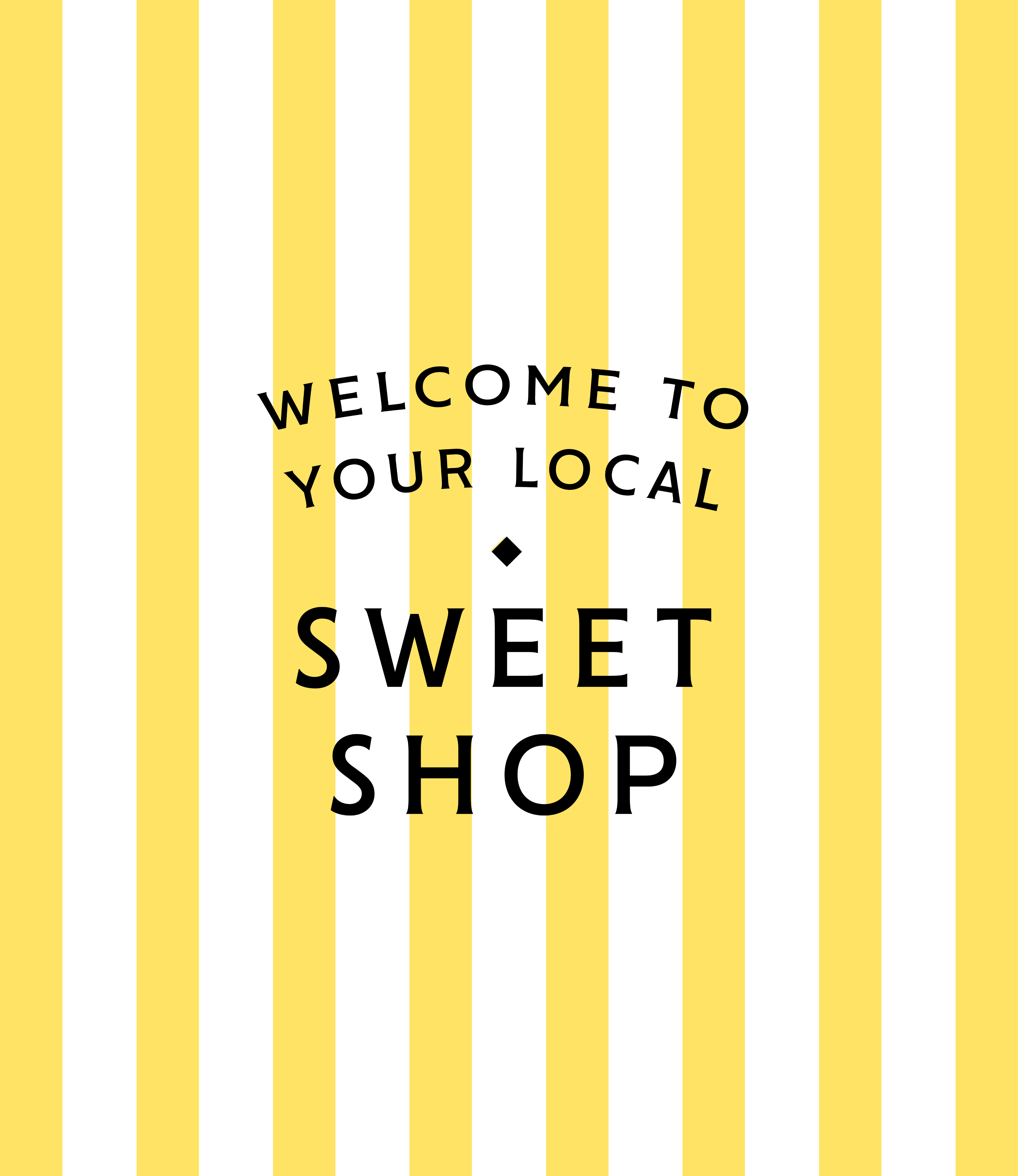
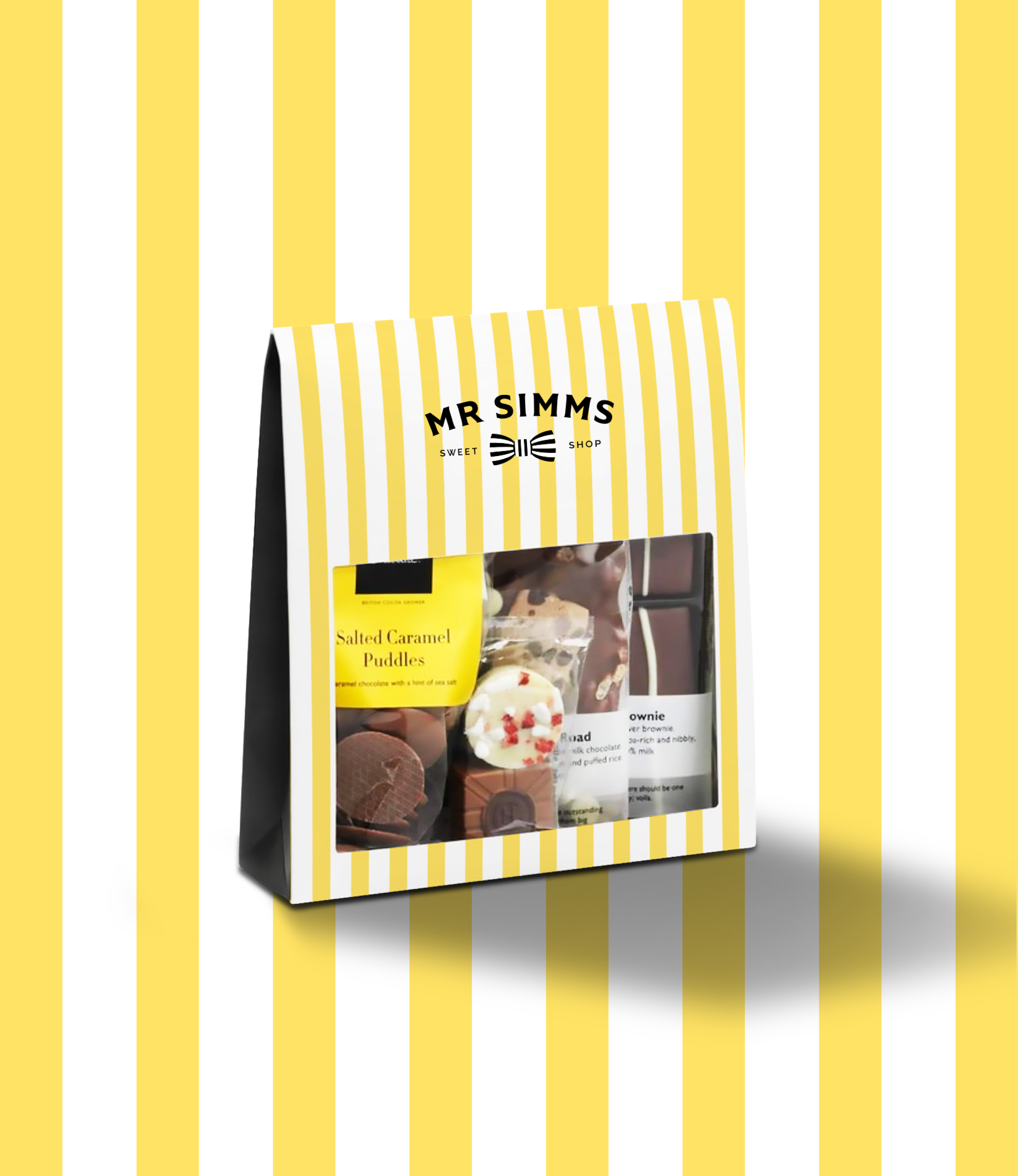
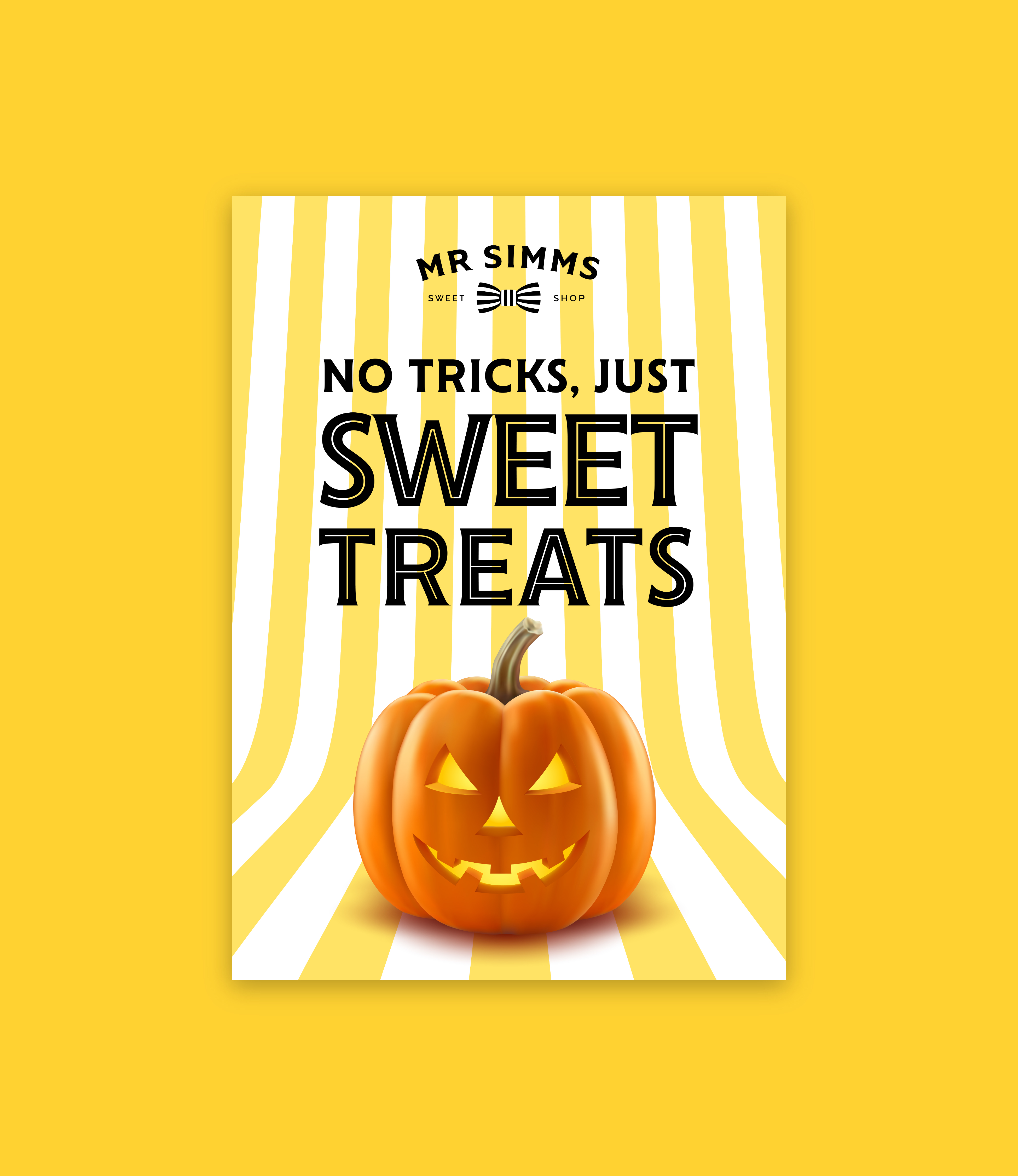
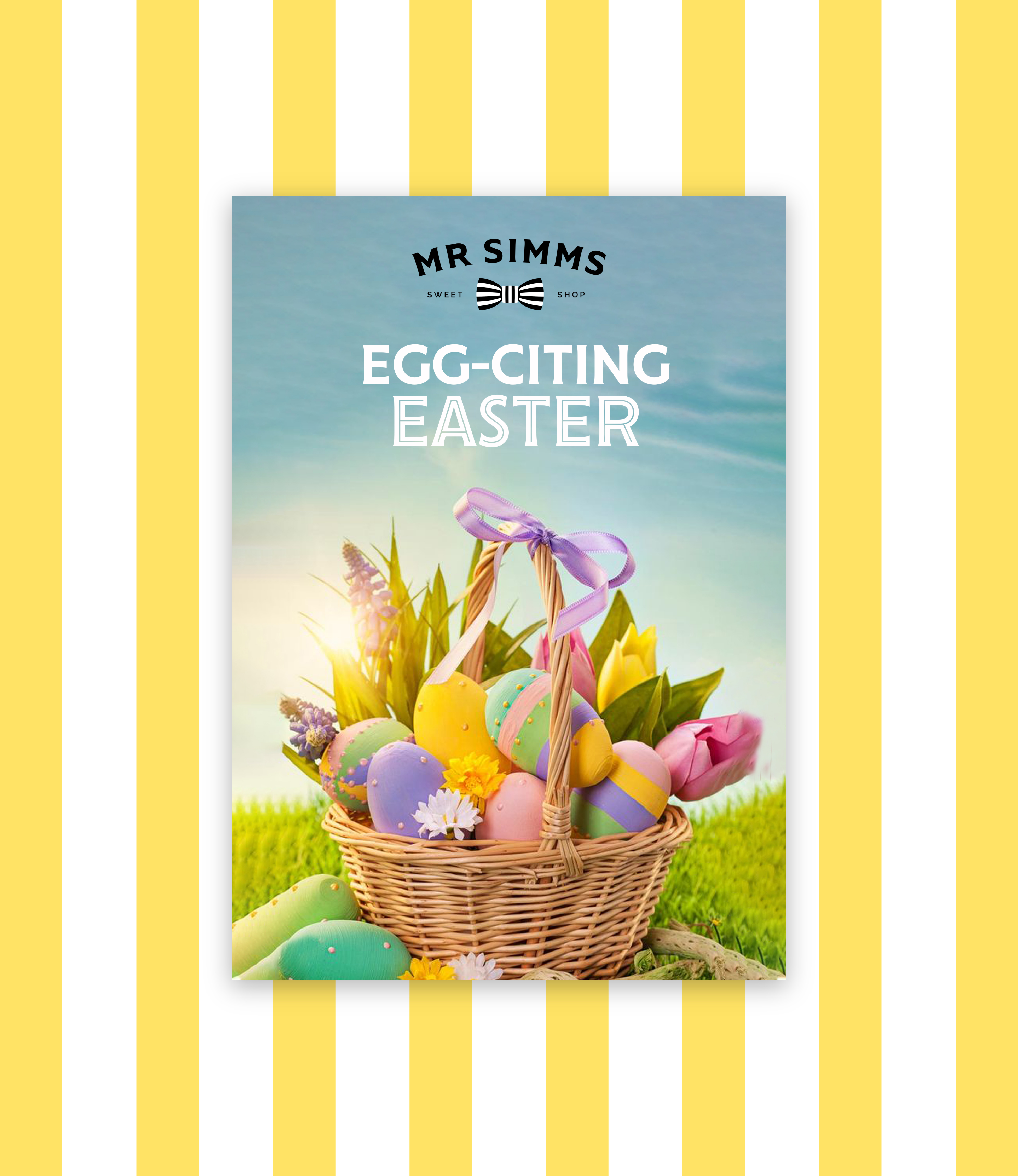
Playful stripes, inspired by the sweets in Mr. Simms' bow tie, serve as the brand's primary pattern. These stripes reflect Mr. Simms' fun personality and bring joy to customers. This simple pattern, with its potential for varied transformations, adds a playful touch to the brand's identity.
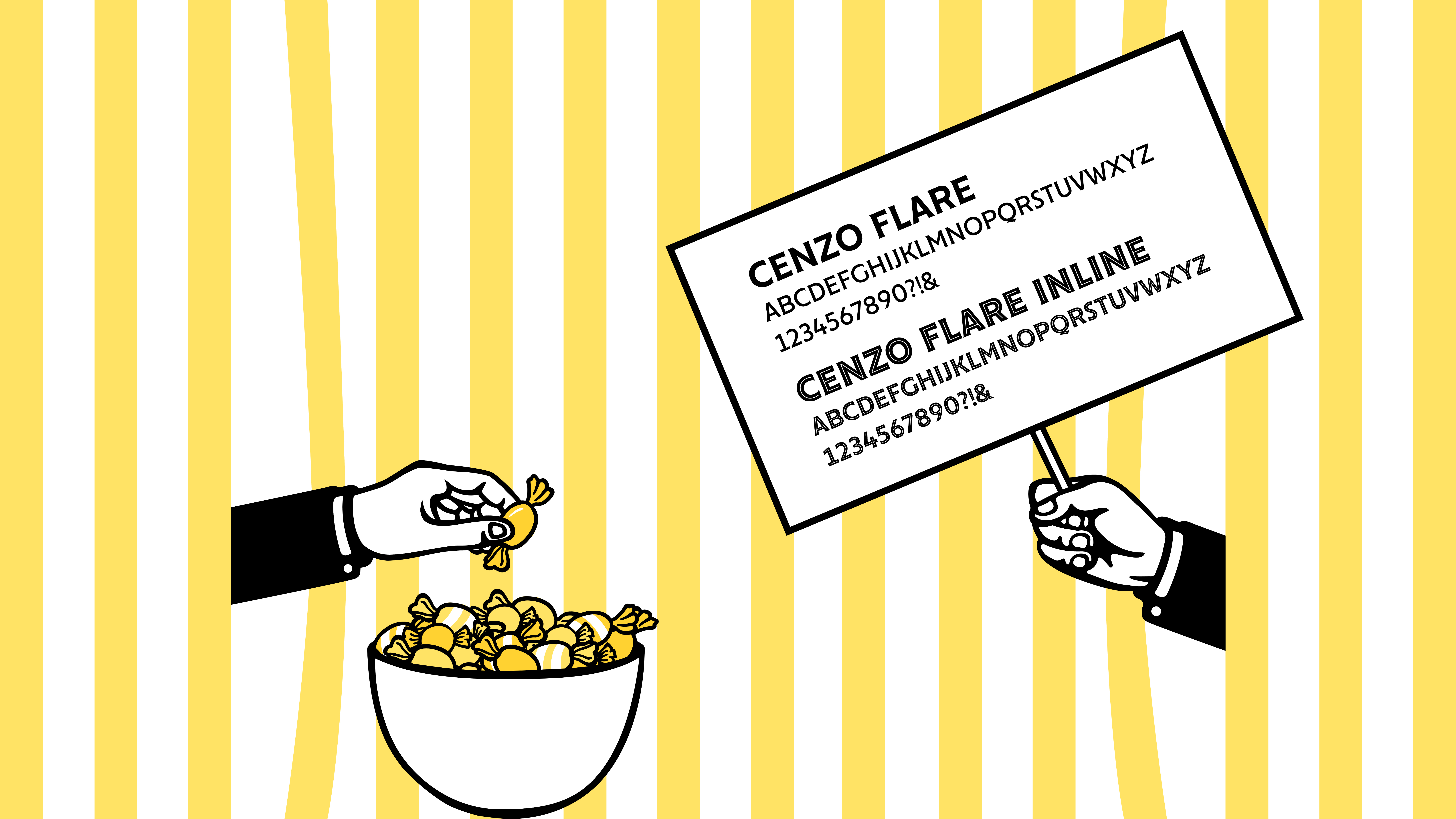
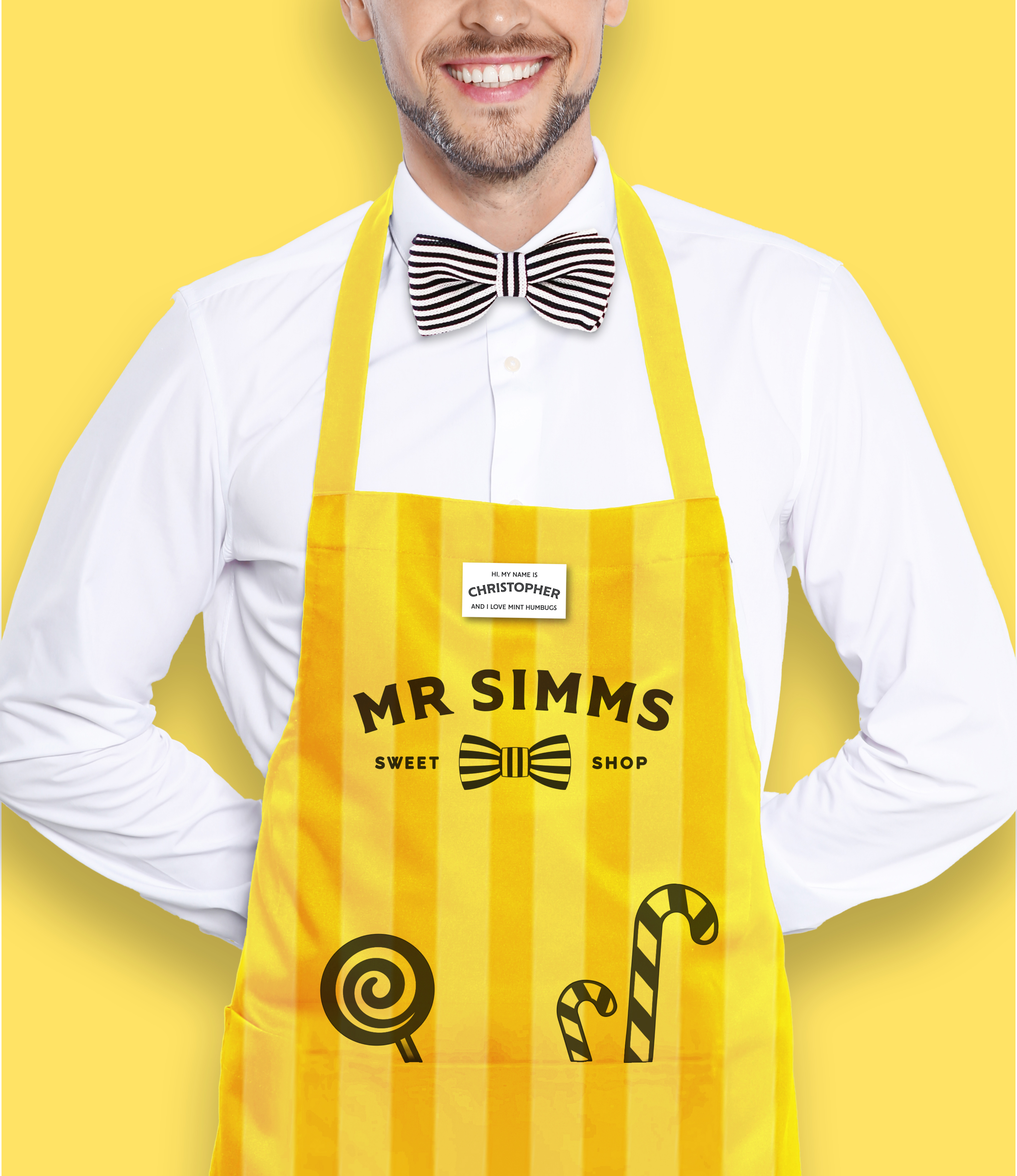
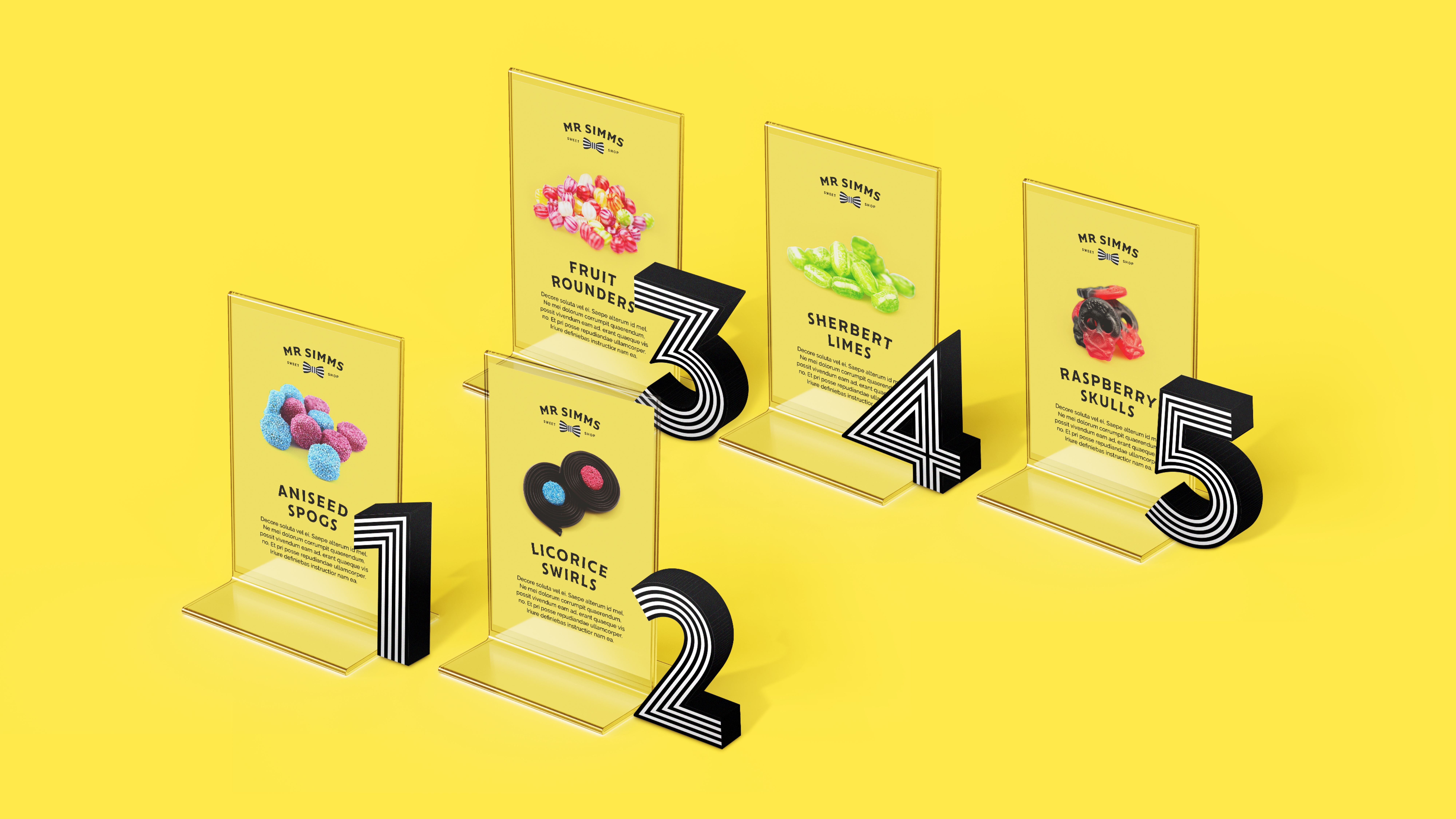
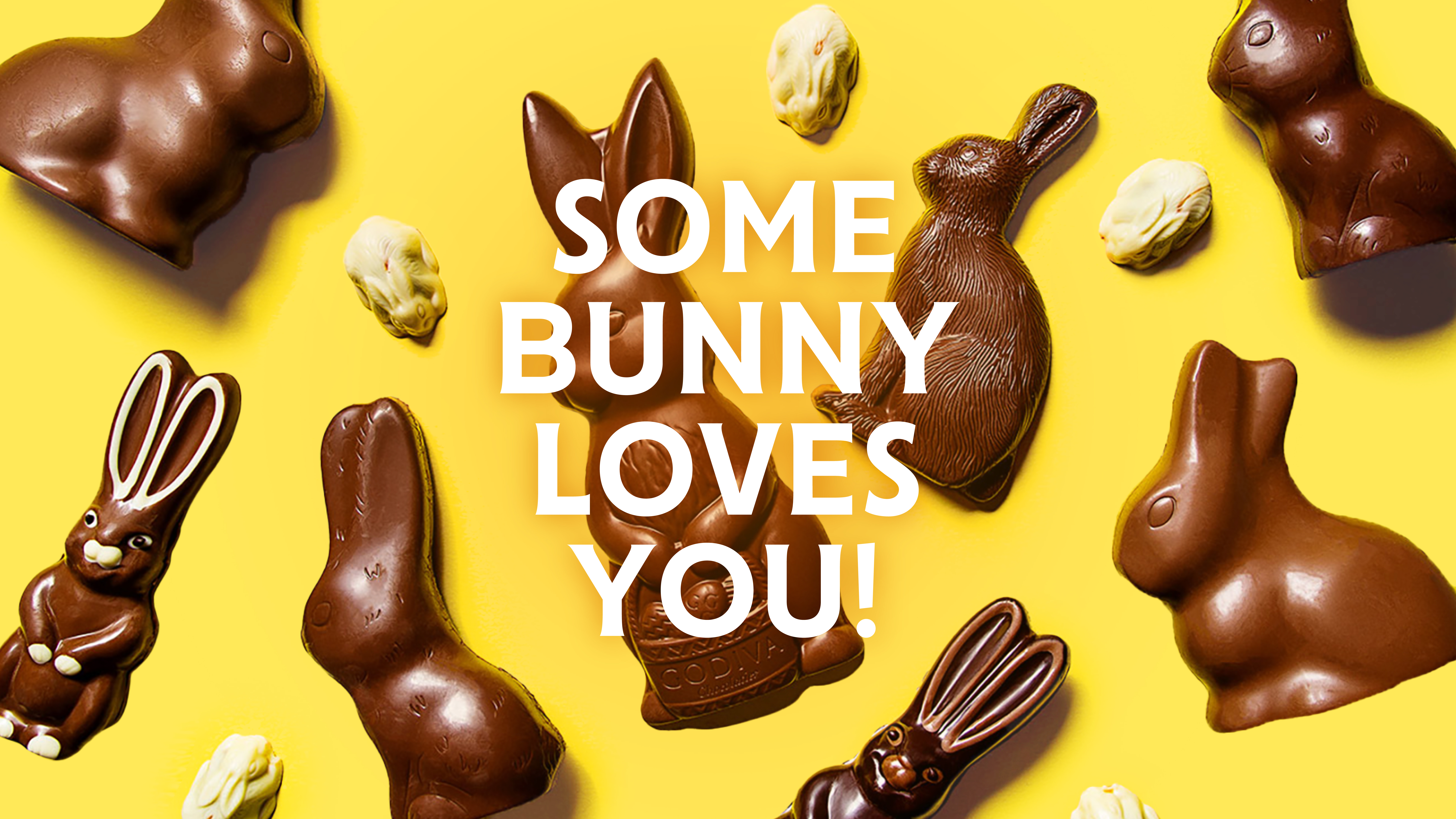
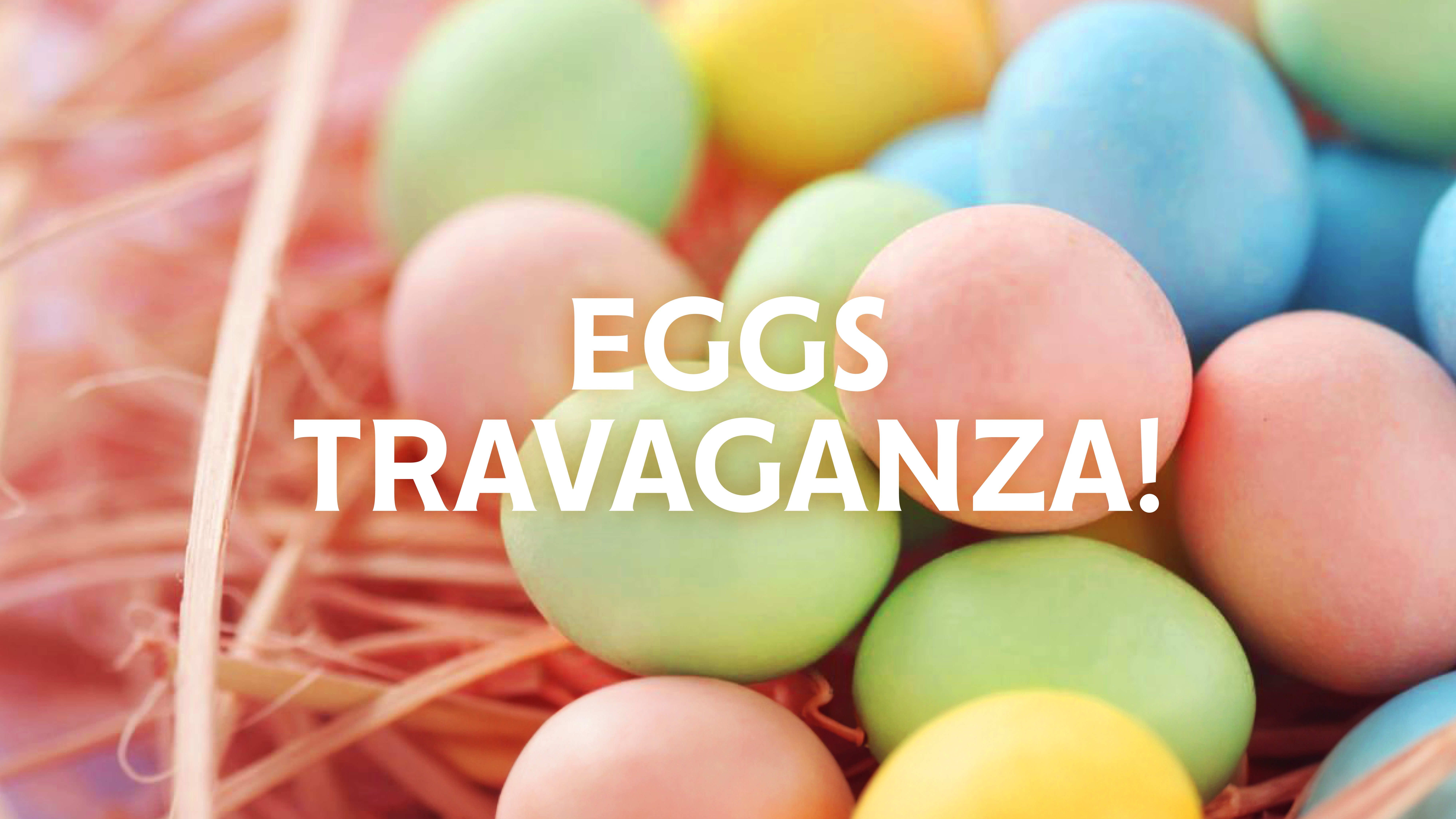
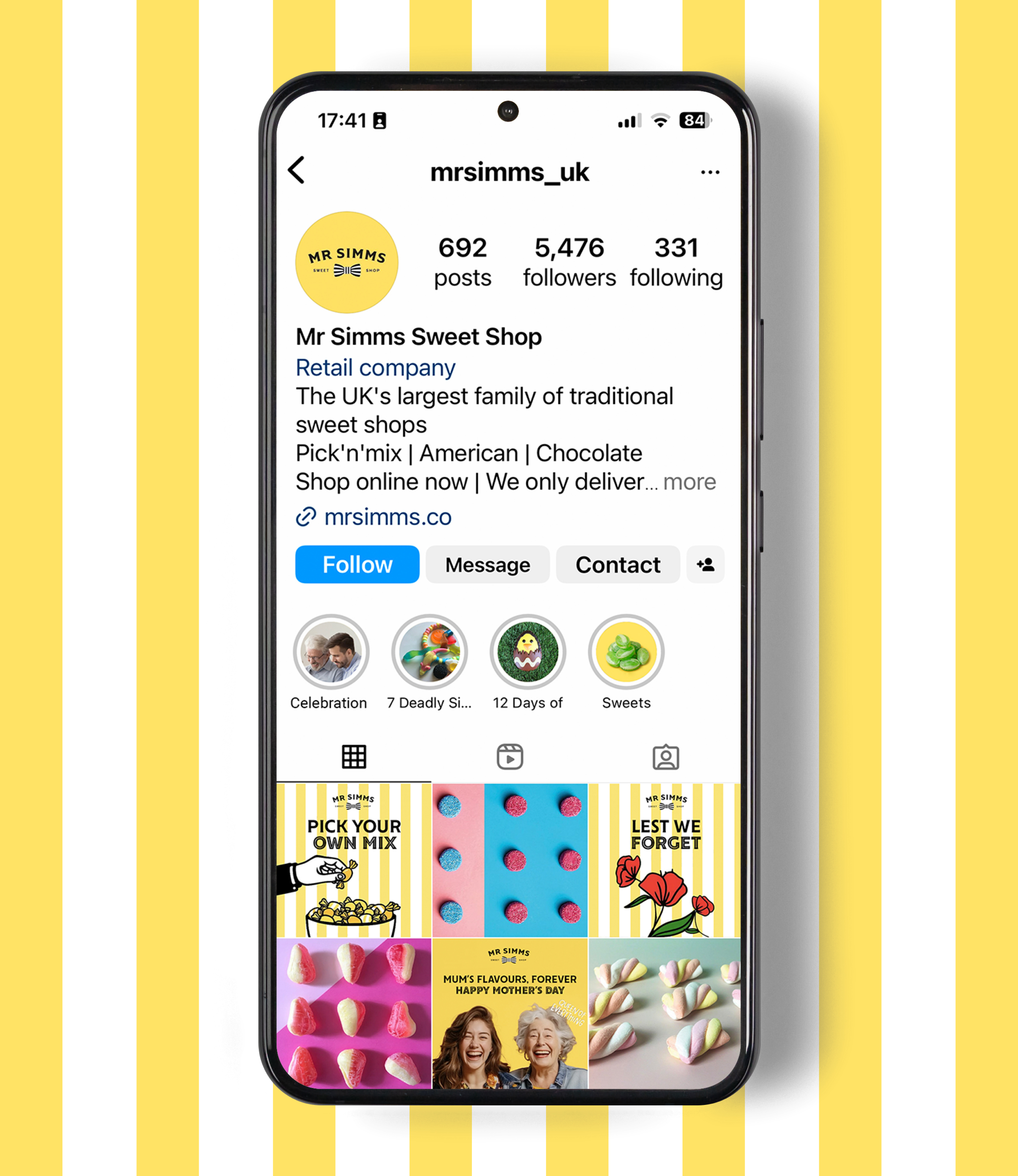
The brand system has been applied across different materials. A brand guideline was developed to cover photography direction, copy style, promotional materials, and illustration styles. We crafted an engaging tone of voice for the copy, aiming to enhance the brand’s fun and playful impression.

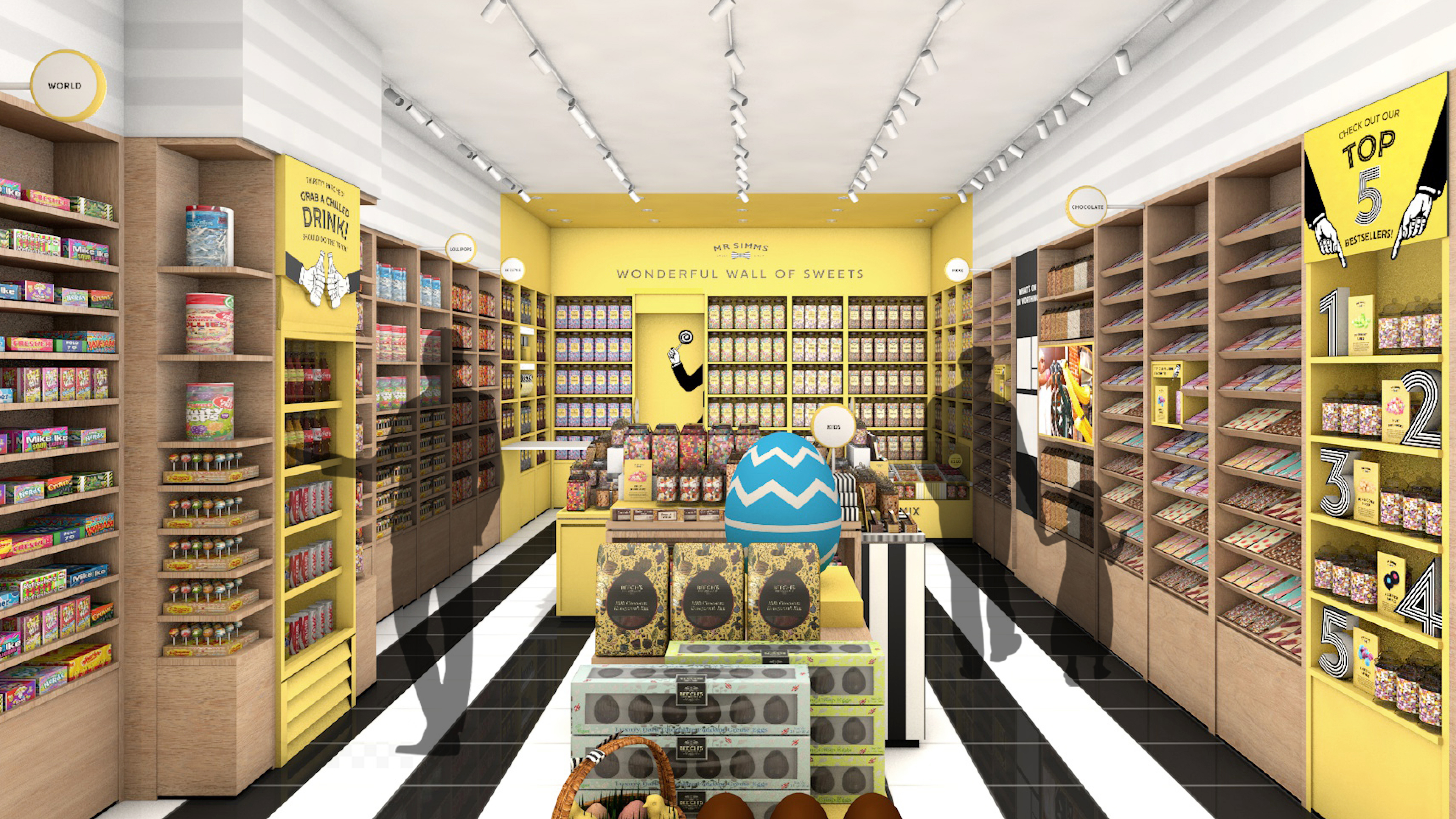
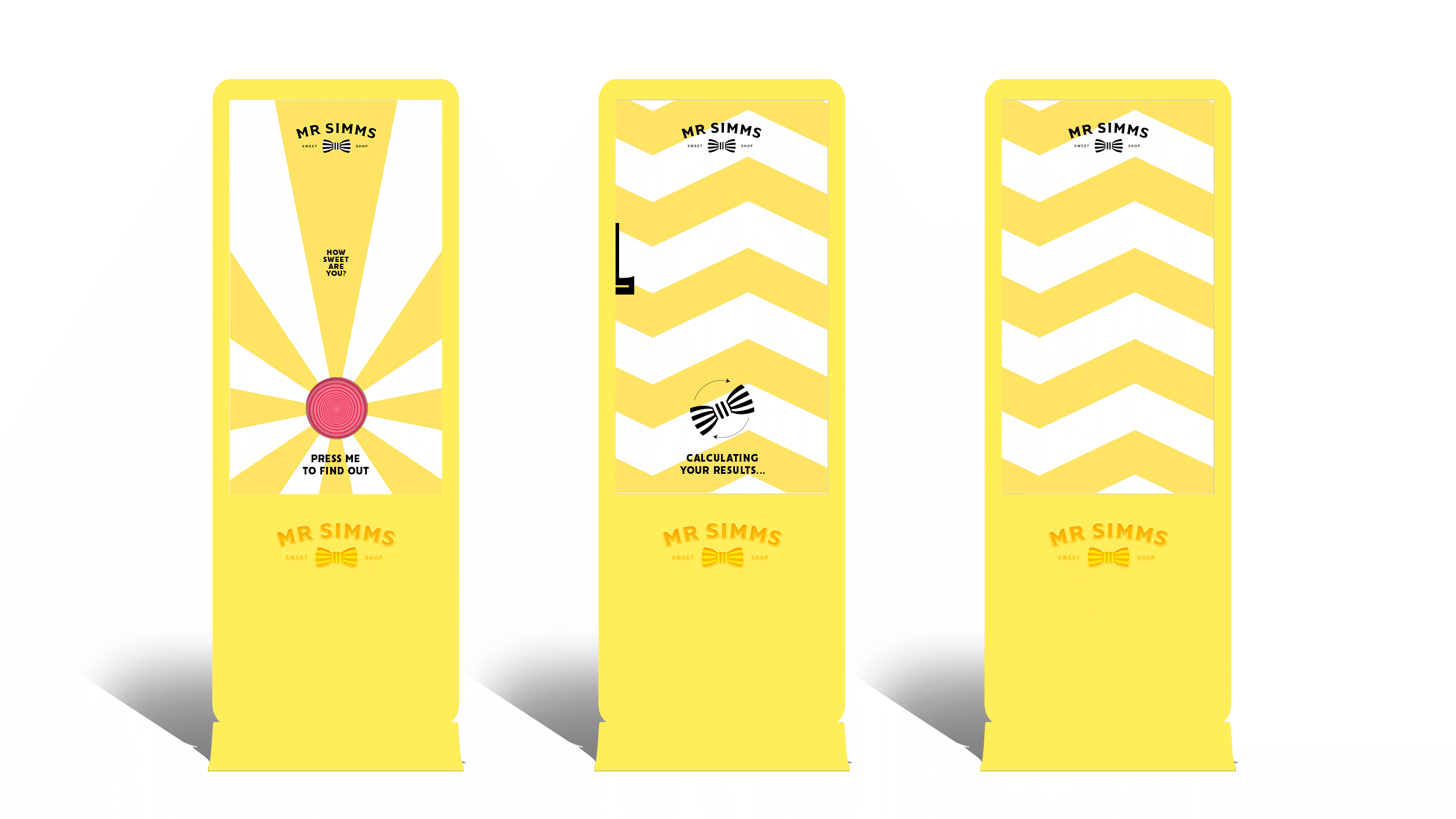
The brand system has been carefully adapted to the physical store design, from the storefront to in-store communications. Additionally, a concept for an interactive selfie machine was proposed. Our goal is to make Mr. Simms' shop more intriguing and welcoming.