Taipei
International
Choral
Festival
A Visual Identity System for a Classical Choir Festival
This choir festival takes place annually during the summer in Taipei, inviting choir groups from around the world to participate.
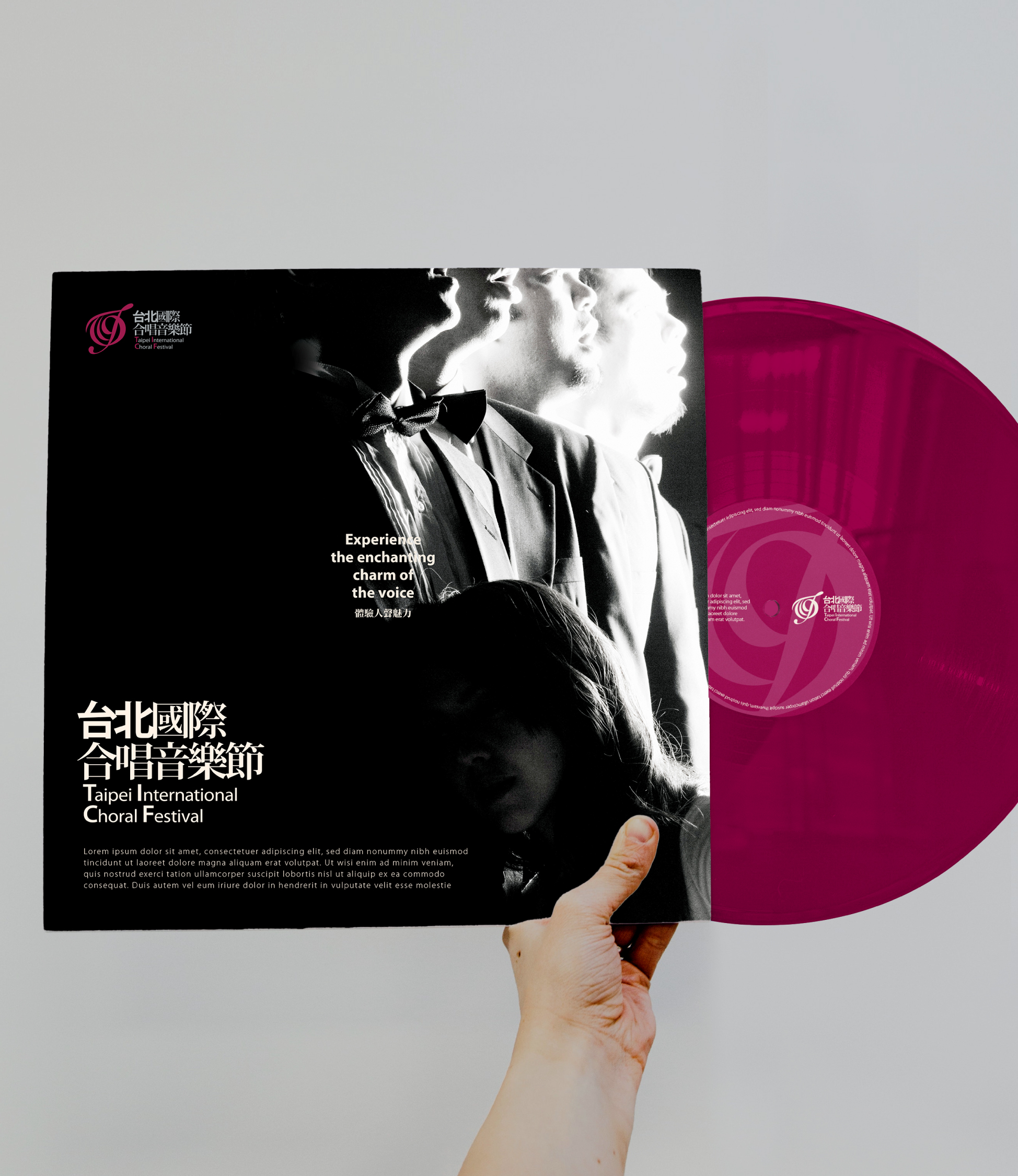
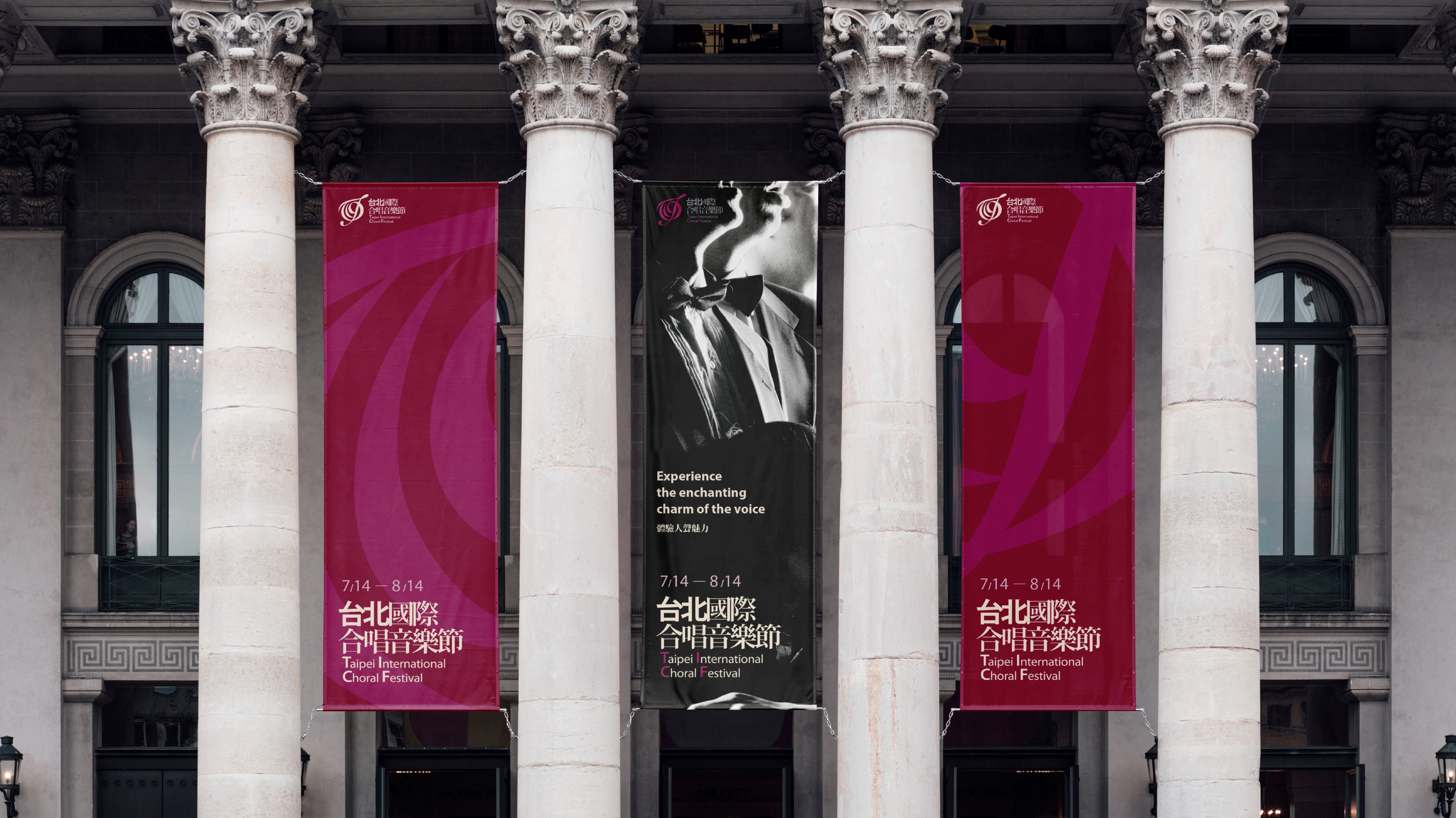
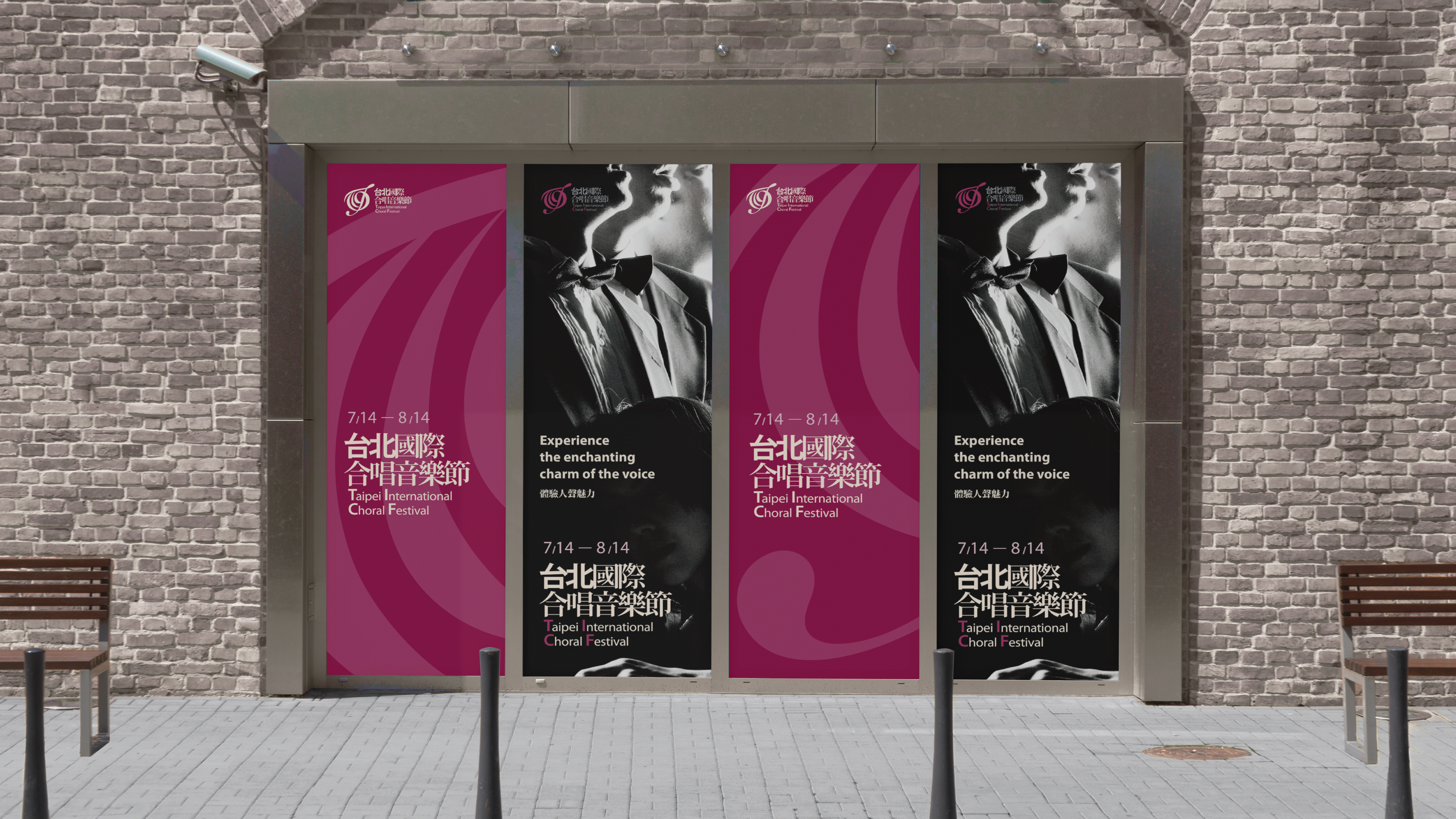
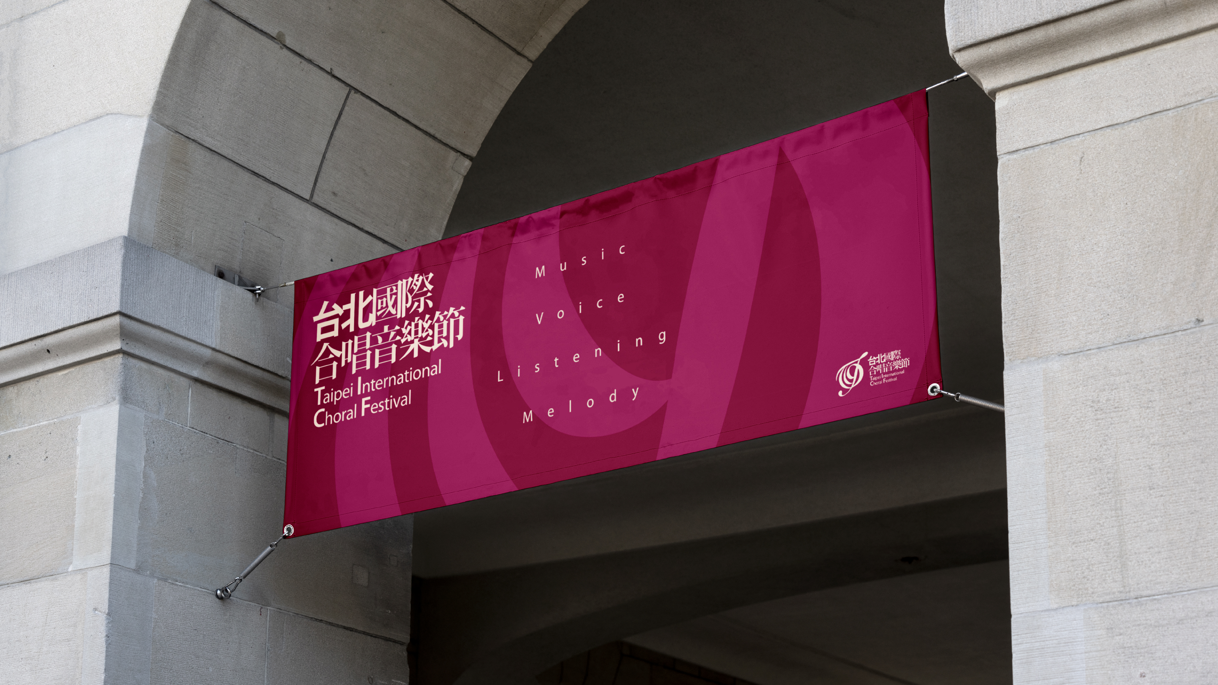
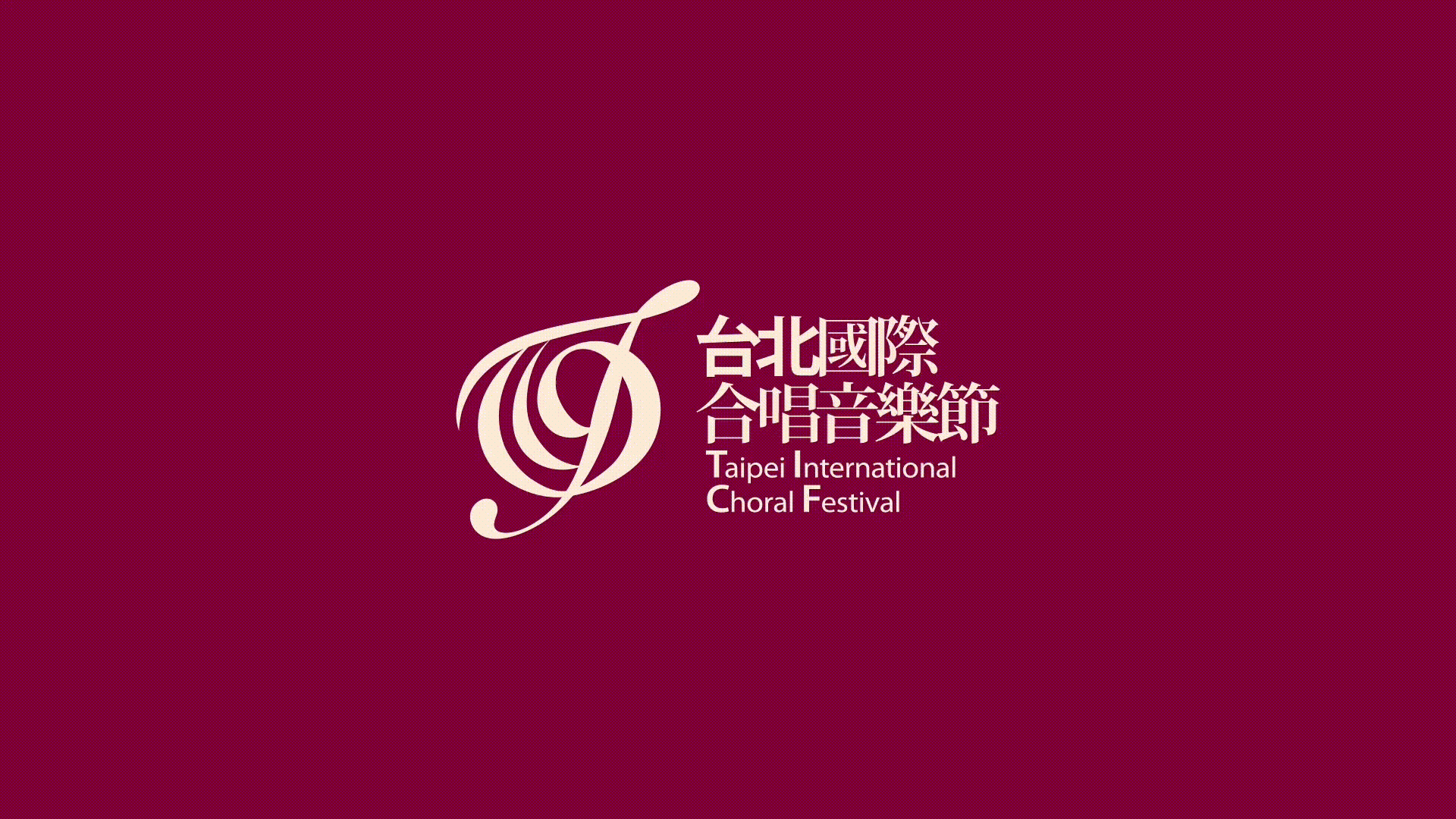
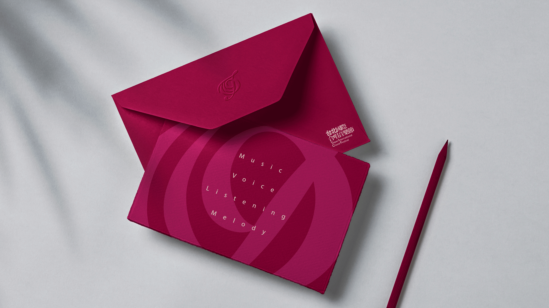
The identity incorporates the initial letters of the Taipei International Choral Festival—T, I, C, and F—arranging them into a treble clef. This design instantly conveys the music-related nature of the event and establishes a connection to the classical music genre.
Client/ Taipei Philharmonic Foundation For Culture And Education (Taiwan)
Creative Direction/ Ching Fu Wang
Strategy/ Ching Fu Wang, Ju Wen Cheng
Tagline/ Taipei Philharmonic Foundation For Culture And Education
Lead Designer/ Ju Wen Cheng
Logo Animation/ Ju Wen Cheng
Art Direction (Photohraphy)/ Ching Fu Wang
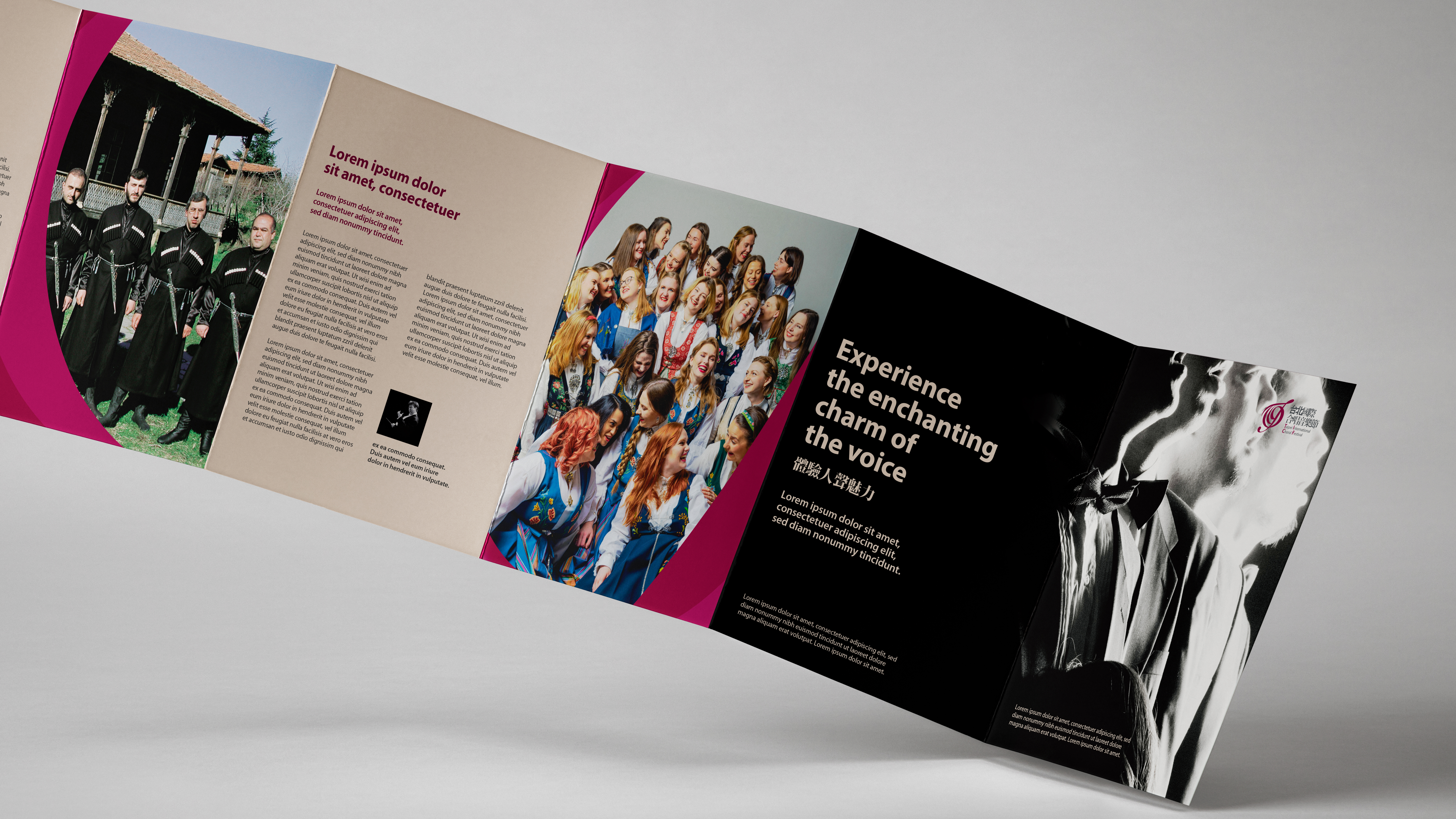
Choir Group Photos/ Taipei Philharmonic Foundation For Culture And Education, Cantus (Norway), St. John's College Choir (South Africa), Chanters Group of The Church of St. Panteleimon The Healer (Georgia)
Conductor Photos/ Ben Oosthuizen, Maestro Gábor Hollerung
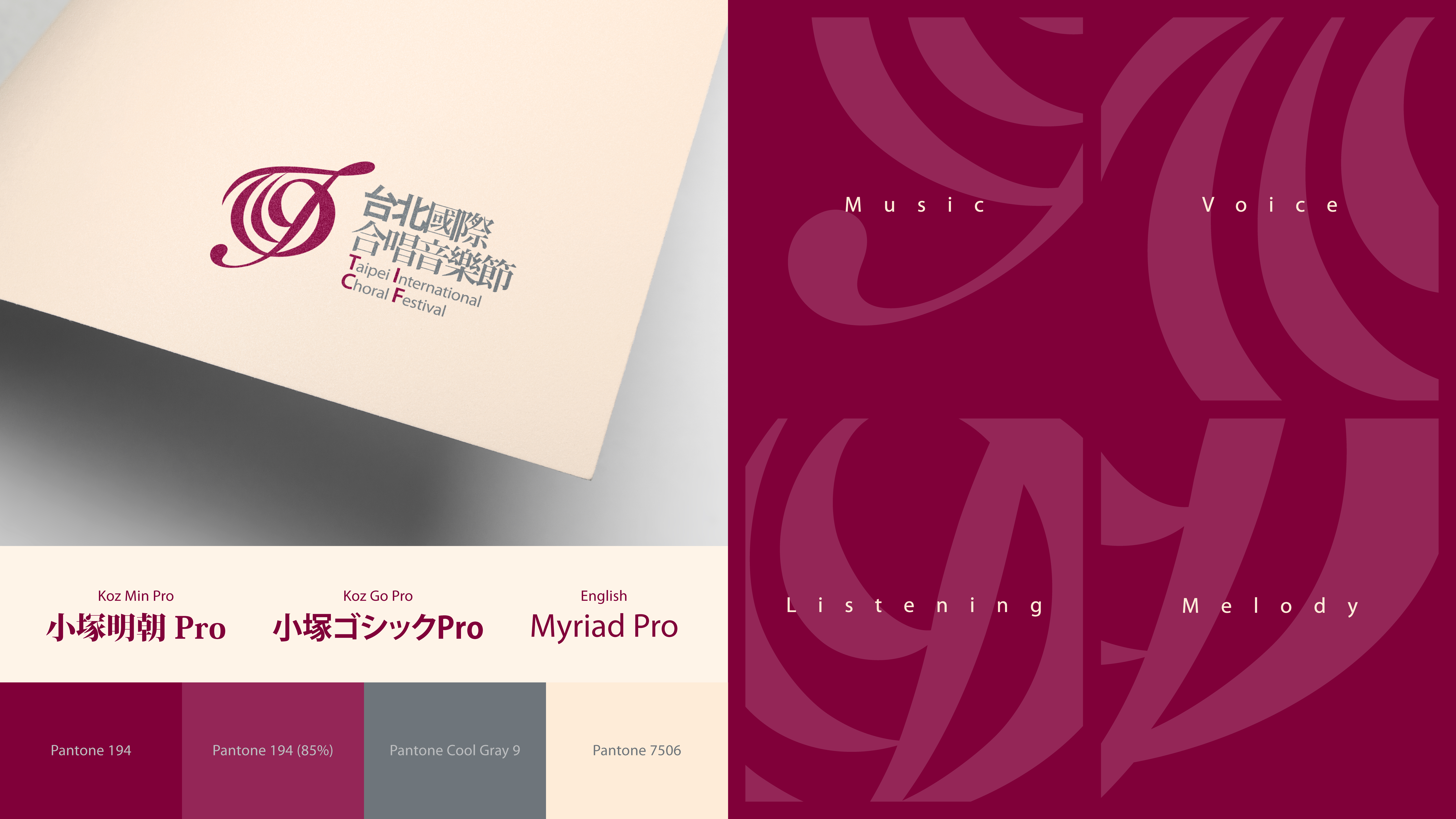
The primary identity colour is adapted from the brand colour of the event organizer, the Taipei Philharmonic Foundation for Culture and Education, as per their request. Two additional secondary colours are included for broader applications.
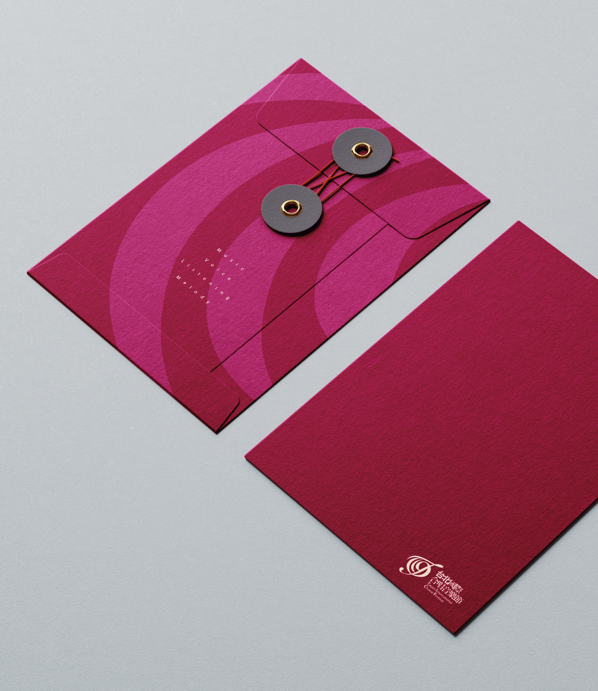
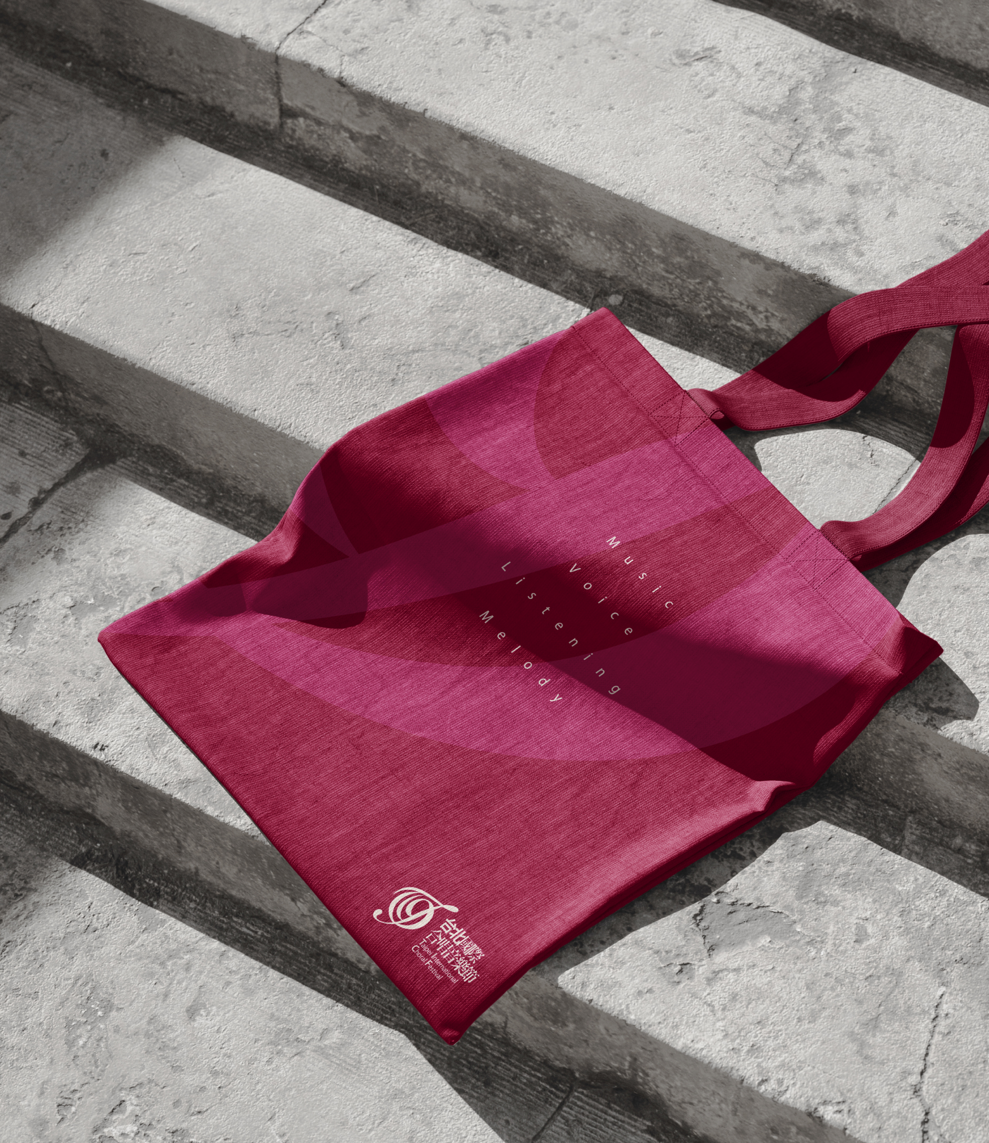
The festival's brand patterns are derived from an enlarged version of the treble clef logo, creating four distinct and elegant patterns that symbolize 'listening,' 'music,' 'voice,' and 'melody.' These patterns are applied across various materials to enhance brand awareness and distinction.
A black-and-white choir image was also created alongside the identity design for that year's festival. It served as a guide for future festivals, demonstrating how to integrate the identity system with key visuals and apply these principles to various promotional materials.